

27 New Shades and a Better Way to Read Them
Little Greene has added 27 interior paint colors, and rethought how the color card itself reads. Five shades join ‘Colours of England,’ which now runs to 128. The rest expand ‘Colour Scales’ into 18 graduated families.
That second part is the useful one. Each family starts from a root color, then steps lighter and darker. Columns run by undertone: warm and pink at left, yellow and green through the middle, cool blue-neutrals at right. Stay in a column for a tonal scheme. Move across for contrast at the same weight. Coordination stops being a matter of holding chips against each other in bad light.
For specifiers, that removes a round of guesswork from any multi-room palette. Corridors, guestrooms, and amenity spaces can share one hue at three strengths. Trim, ceilings, and millwork resolve without a second sampling cycle. Deeper variants close out a scheme without introducing another color to track.
The new paint colors follow a broader retreat from saturation. Ashes of Marigold takes the brand’s ’70s-era Marigold and tempers it with black into a warm, earthy terracotta. Barge Stone answers the demand behind Portland Stone with a cooler green undertone. Perpetual Blue, drawn from a surviving palette in Winston Churchill’s studio at Chartwell, reads deeper and greener as light shifts across it. Flight Pink, found on the great staircase at Wimpole Hall, behaves more like a warm neutral than a pink.
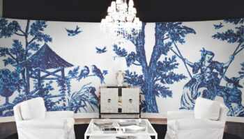
Nothing here asks for attention. That is the argument. Specified alongside the brand’s botanical wallcoverings, these shades are built to hold a room together rather than run it. On a project where the paint outlasts the furniture, that is the more useful trait.
Images Courtesy of Little Greene


Ready to spec what you see? Try Designer Pages PRO free for 30 days.
Related Posts


Leave a Reply