

Chromatic Control
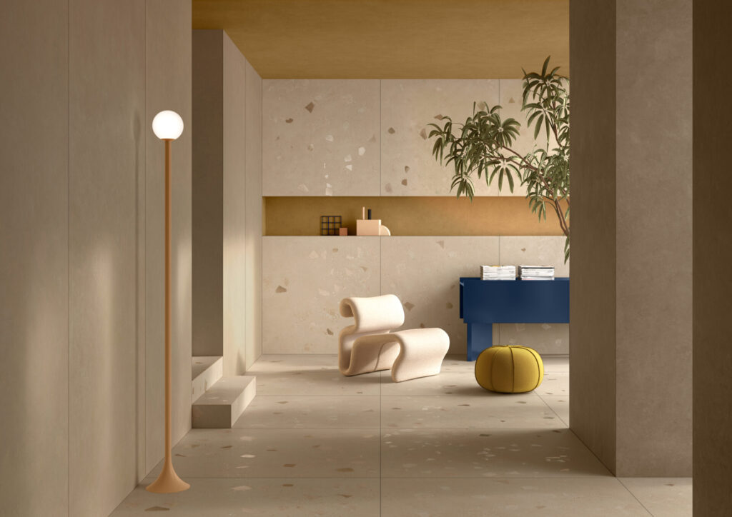
VitrA Tiles has developed V-Tone, a breakthrough in sustainable ceramic tiles that solves one of the industry’s most persistent challenges: color inconsistency. By ensuring perfect chromatic continuity across every batch and size, V-Tone allows designers to work with new confidence and precision.
The difference is subtle yet profound. Shades align seamlessly from wall to floor, light to shadow, detail to expanse. Even large-scale installations feel cohesive, calm, and controlled. Collections like NovaFlake and NovaPetra show how tonal harmony can enhance architectural rhythm rather than distract from it.
Sustainability is also at play. The company’s “100% Recycled Porcelain Tile” initiative turns production waste into high-quality material, setting a new model for circular design. Together, these advances reveal a vision of ceramics that values consistency, restraint, and environmental responsibility in equal measure—a quiet evolution with a lasting impact for sustainable ceramic tiles across commercial and residential spaces alike.
For designers drawn to surface as both structure and story, Terrazzo with a Fresh Edge explores a similar balance between material innovation and timeless appeal.
Images Courtesy of VitrA

Ready to spec what you see? Try Designer Pages PRO free for 30 days.
Related Posts


Leave a Reply